
ADOBE MENTORSHIP PROGRAM SPRING 2026
Multi-Location Booking System Design
Redesigned website styling and streamlined the booking experience across multiple services in a multi-location photography studio.
Role
Lead UX Designer
Team
1 Producer
3 Designers
Service
UX/UI Design
UX Research
Vibe Coding
Timeline
Feb 2026 – Apr 2026
Tool Used


Overview
What is FotoLab?
Fotolab is a New York–based photography studio with additional locations in Houston and an upcoming studio in Los Angeles. The studio offers a range of services, including self-portrait sessions, ID photography, studio rentals, and photobooth rentals.
My Role
As the UX Lead of a four-person team, I led prototype usability testing, designed wireframes and high-fidelity prototypes, and guided the team toward a clear, user-centered design direction.
The Challenge
To support the scaling of its NYC studio, FotoLab set out to redesign its website to address two key challenges: a high volume of booking-related support inquiries and a low conversion rate. The goal was to create an intuitive, self-service booking experience that reduces friction, expands reach to a broader audience, and improves overall conversion.
Impact
1 Min
time to complete booking through a streamlined, self-service flow
87%
increase in booking conversion rate by simplifying the user journey
65%
reduction in booking-related support inquiries through clearer information and guided booking
CONTEXT
FotoLab offers different services across mutiple locations
FotoLab is a New York based photography studio. It has multiple locations, each offering slightly different services and operating hours. As a team of four, our goal was to land on a clear vision within 2 months.


CLIENT PROBLEM #1
Booking experience creates confusion across locations
The current site structure creates friction, with unclear service descriptions and location differences leading to user confusion and missed conversions.
CLIENT PROBLEM #2
Unclear information drives repetitive inquiries
A high volume of repetitive inquiries about basic information creates administrative burden, prompting the need for clearer, more accessible content on the website.
CLIENT PROBLEM #3
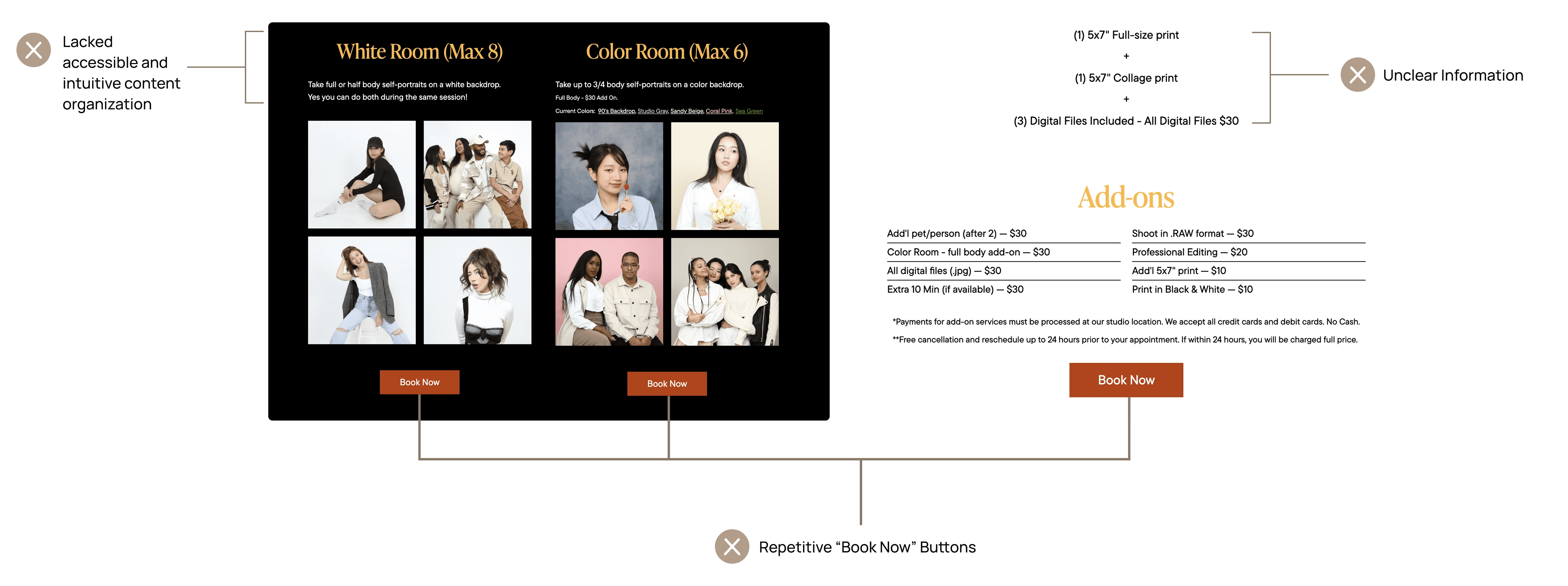
Confusing Menu Structure and Information Hierarchy
The menu structure mixes location information with service offerings, making it difficult for users to navigate. Key services and CTAs are not clearly highlighted, resulting in an unclear information hierarchy.

CLIENT GOAL
Expand audience base and increase booking conversion
Client wants to expand their online presence and customer base, especially to non-Asian audiences less familiar with self-portrait photo booths. The goal is to increase their bookings by attracting a larger and more diverse audience base.

COMPETITIVE ANALYSIS
Learning from What Works and What Doesn’t
By analyzing competitors’ booking flows, visual consistency, and accessibility, we identified effective patterns to adopt and key pain points to avoid in designing a more cohesive and user-friendly experience.

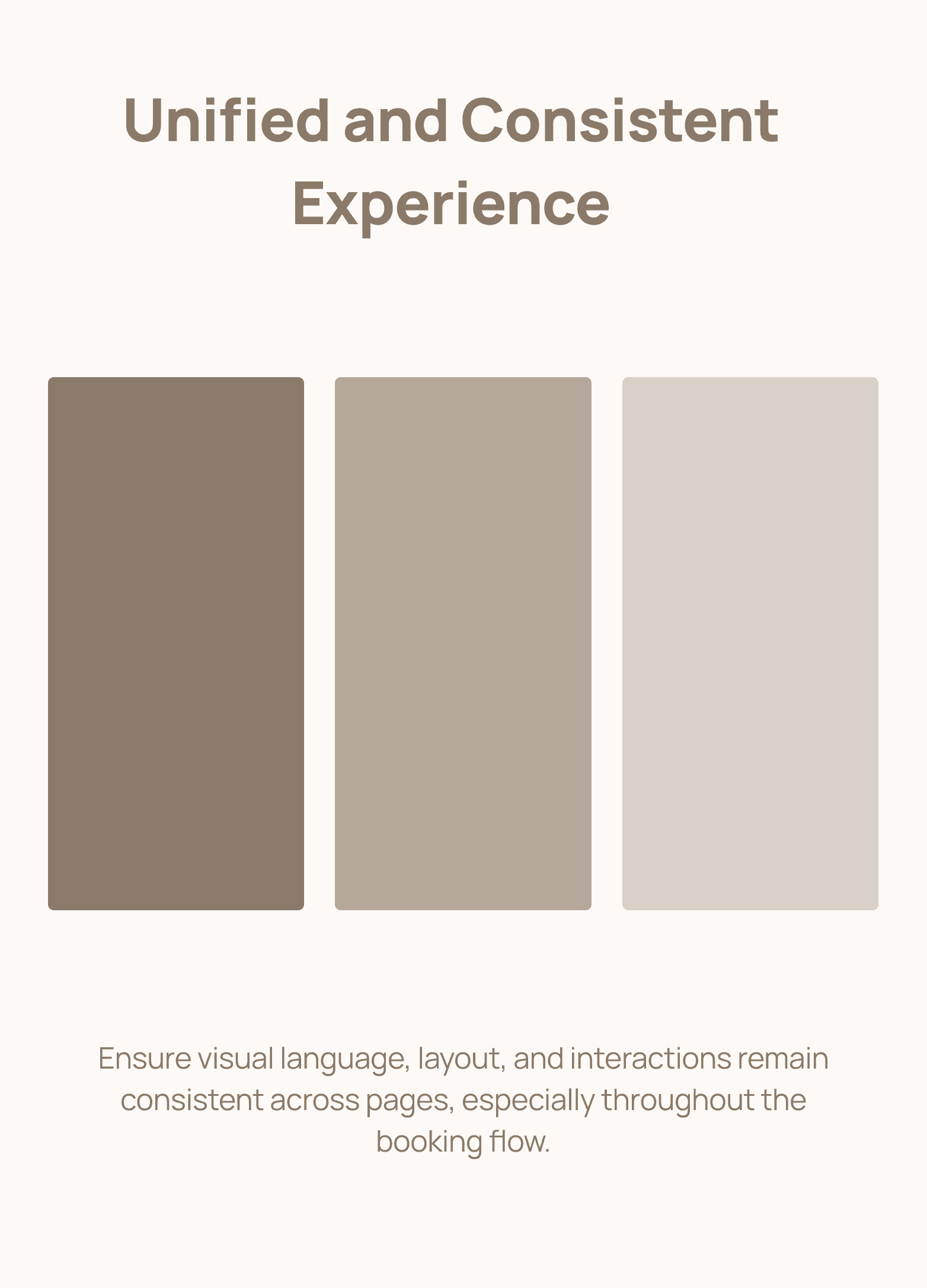
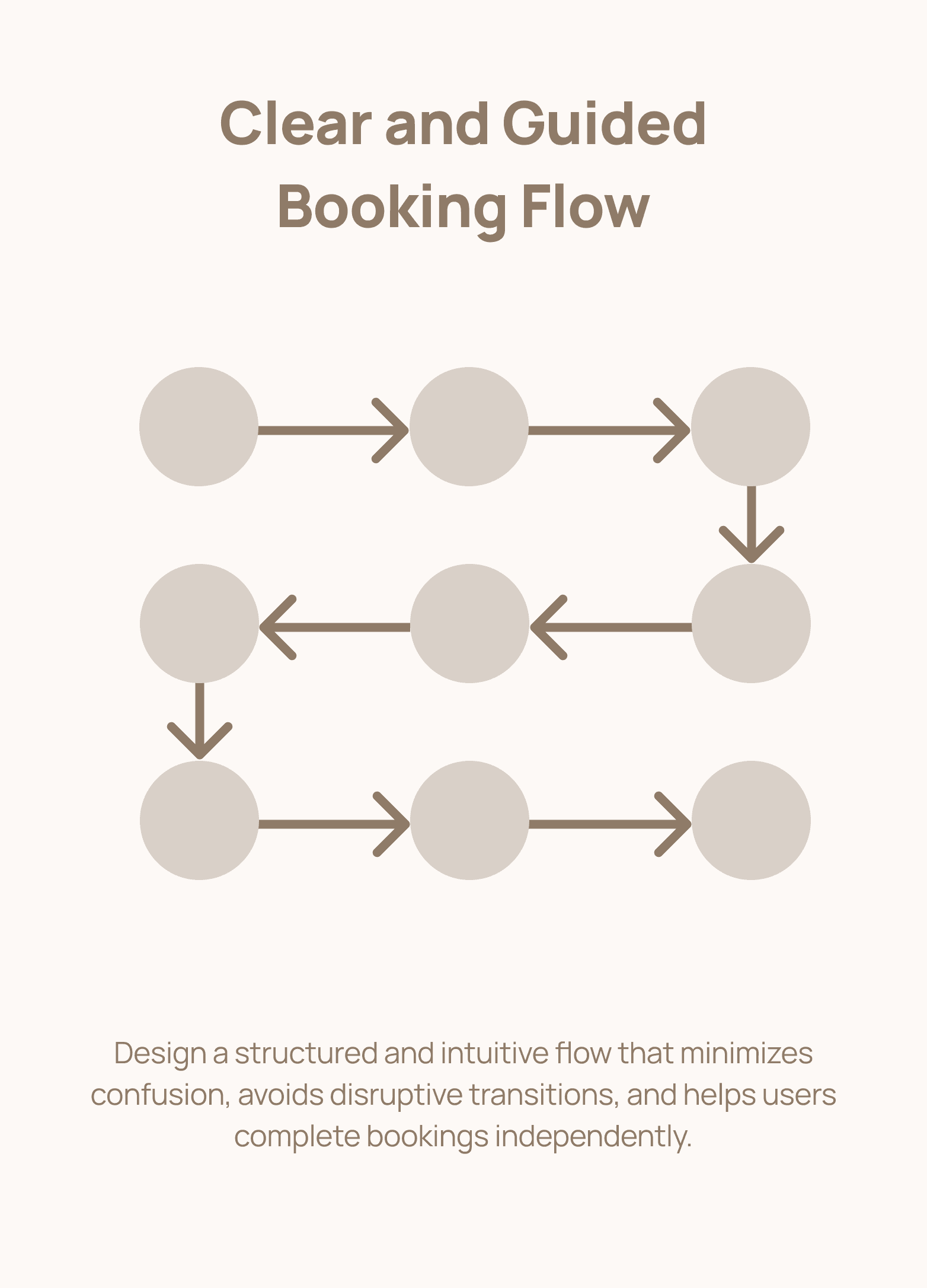
DESIGN PRINCIPALS
We defined three principles to guide our design
Based on insights from our competitive analysis, we defined three guiding principles to create a more cohesive, accessible, and user-friendly booking experience.

HOW MIGHT WE?
How might we make it easy for users to understand and navigate different services across multiple locations, and complete bookings with confidence?
DESIGN APPROACH #1: RESTRUCTURING THE SITEMAP
Redesigned the sitemap to support a clearer booking flow.
Given that FotoLab offers different services across multiple locations, we structured the experience to guide users to first select a location, then choose services, and finally complete the booking form.
DESIGN APPROACH #2: TRANSLATING SITEMAP INTO WIREFRAMES
Designing a location-first structure across key pages
We focused on key pages to quickly establish the overall structure and interaction patterns, starting with low-fidelity wireframes and evolving into high-fidelity designs for testing and refinement.

DESIGN APPROACH #3: USABILITY TESTING
Testing high-fidelity wireframes with both first-time and returning users
By testing with both first-time and experienced users, we identified key friction points in navigation, terminology, and decision-making throughout the booking process.
BUILDING THE DESIGN SYSTEM
Refreshing the Design System to Elevate Brand Perception
The previous design system lacked a modern and cohesive visual identity, limiting its appeal to broader and more premium audiences. We redesigned the system to create a more elevated, contemporary, and accessible brand experience.

DESIGN ITERATION #1: IMPROVING SERVICE DISCOVERY
Simplifying the page structure to support a clearer, location-based browsing flow
To address the confusion of "Unclear Hierarchy and Information Overload" and "Inconsistent Terminology"during usability testing, we used the redesigned design system to restructure the page, creating a clearer information hierarchy, reducing information overload, and refining terminology to support a more flexible and intuitive service exploration experience.

DESIGN ITERATION #2: IMPROVING BOOKING FLOW
Creating a more intuitive booking experience through real-time feedback and flexible booking entry points
Based on usability testing feedback, we reduced excessive CTAs and improved location clarity by introducing two entry paths into the booking flow tailored to different user needs. Key information remains visible throughout the process, with real-time feedback on selections to create a more intuitive and seamless booking experience.
DESIGN ITERATION #3: SEPARATING B2B & B2C SERVICES
Creating Distinct Paths for B2B and B2C Photo Booth Services
Usability testing revealed that users had difficulty distinguishing between the two Photo Booth services when they were presented within the same flow. To create clearer user pathways, we separated the experiences based on audience needs by integrating the consumer-facing service into the booking flow while surfacing the business-focused service through the navigation menu. This restructuring helped reduce confusion and better align each journey with user intent.
RAPID PROTOTYPE WITH AI
Exploring interaction and motion before presenting to the client
Before presenting to the client, we used AI tools to quickly prototype animations and key booking flows. This allowed us to explore interaction patterns and visualize the experience early, helping us validate ideas before moving into final design.
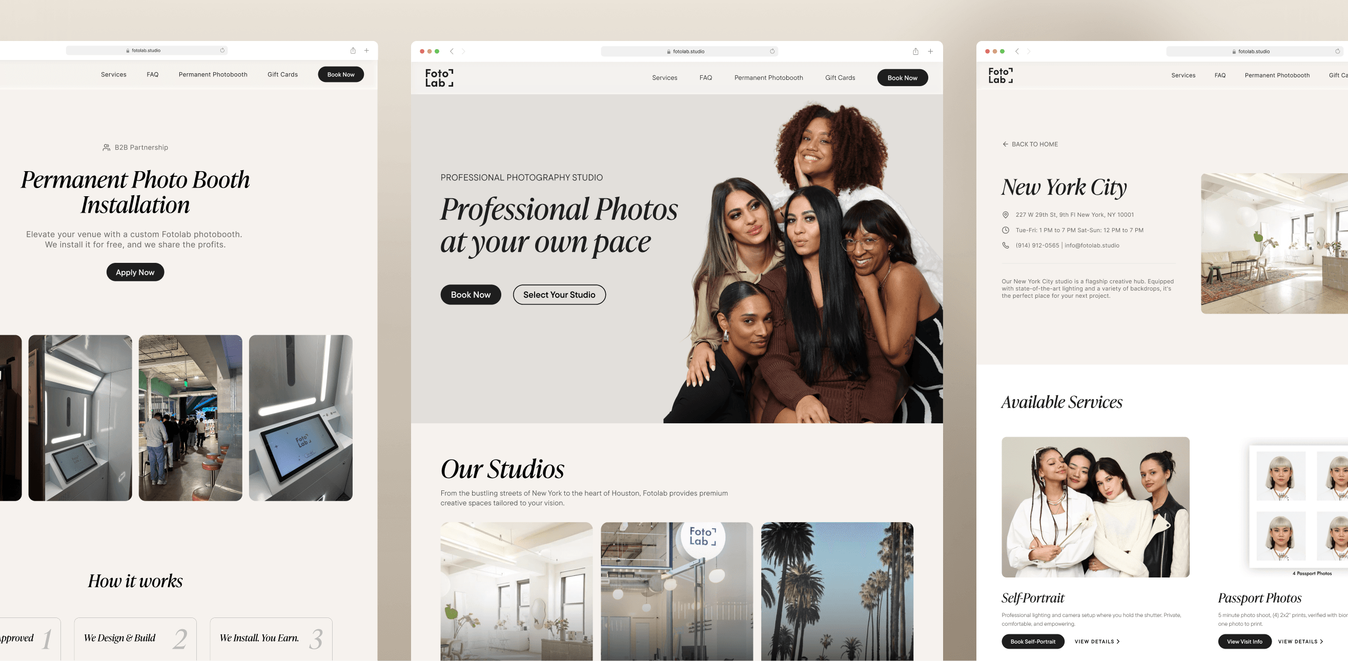
FINAL DESIGN
Key Feature 1: Separate locations to reduce confusion and help users quickly find relevant services
Each location has its own dedicated page with tailored services and detailed information. This allows users to first choose a studio, then explore only the services available at that location, reducing cognitive load and unnecessary browsing.
FINAL DESIGN
Key Feature 2: Simplified steps to help users select services and add-ons with ease
The booking flow was redesigned to guide users step-by-step, from selecting a location to choosing services and add-ons. By improving structure and visual hierarchy, users can complete bookings more efficiently with fewer questions or drop-offs.
FINAL DELIVERABLE


